Lab10
Laura J. Costello
2025-04-12
## Warning: package 'ggtext' was built under R version 4.4.3## Warning: package 'ggthemes' was built under R version 4.4.3##
## Attaching package: 'dplyr'## The following objects are masked from 'package:stats':
##
## filter, lag## The following objects are masked from 'package:base':
##
## intersect, setdiff, setequal, union## Warning: package 'ggbeeswarm' was built under R version 4.4.3## Loading required package: colorspace## Warning: package 'waffle' was built under R version 4.4.3## Warning: package 'ggridges' was built under R version 4.4.3## ---- Compiling #TidyTuesday Information for 2020-07-14 ----
## --- There is 1 file available ---
##
##
## ── Downloading files ───────────────────────────────────────────────────────────
##
## 1 of 1: "astronauts.csv"
## ---- Compiling #TidyTuesday Information for 2020-07-14 ----
## --- There is 1 file available ---
##
##
## ── Downloading files ───────────────────────────────────────────────────────────
##
## 1 of 1: "astronauts.csv"Let’s do a beeswarm to show how the activity of the US and USSR/Russian space programs have varied over time
And just to cringe, let’s color it by gender
# To make the colored dots visually group, let's sort the dataframe first (hacky - not guaranteed)
through_time_beeswarm <- astronauts %>%
  filter(nationality %in% c("U.S.","U.S.S.R/Russia")) %>%
  arrange(sex) %>%
  ggplot(aes(y=nationality,x=year_of_mission,color=sex)) +
  geom_beeswarm() +
  labs(
    title = "Fluxuation in Astronaut-Missions Through Time",
    subtitle = "Each dot is an astronaut on a mission in the specified year",
    x = "Mission Year",
    y = "US vs. USSR/Russia",
    color = "Sex",
    caption = "Data: TidyTuesday astronauts"
  ) +
  theme(plot.title = element_text(face = "bold", size = 14))
through_time_beeswarm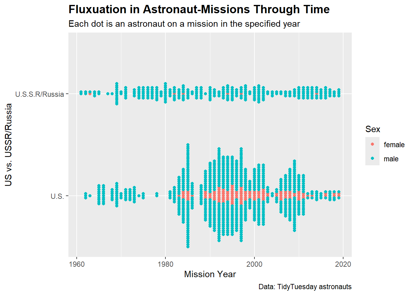
ggsave("through_time_beeswarm.pdf", through_time_beeswarm, width = 11, height = 8.5, units = "in")Let’s lean in to the gender cringe and look at proportions of male and female astronauts between the US and USSR/Russia and overall with a pie chart
my_cols <- c("#FFB6C1","#FF69B4","#87CEFA","#1E90FF")
gender_pie <- astronauts %>%
  filter(nationality %in% c("U.S.","U.S.S.R/Russia")) %>%
  group_by(name,sex,nationality) %>%
  summarize(count=n(),.groups="drop") %>%
  mutate(group=paste(sex,nationality,sep="-")) %>%
  ggplot(aes(x="",y=count,fill=group)) +
  geom_col() +
  coord_polar(theta="y")  +
  scale_fill_manual(values = my_cols) +
  labs(
    title = "Astronaut Sex: U.S. and U.S.S.R/Russia",
    fill = "Sex-Nationality",
    caption = "Data: TidyTuesday astronauts"
  ) +
  theme(plot.title = element_text(face = "bold", size = 14))
gender_pie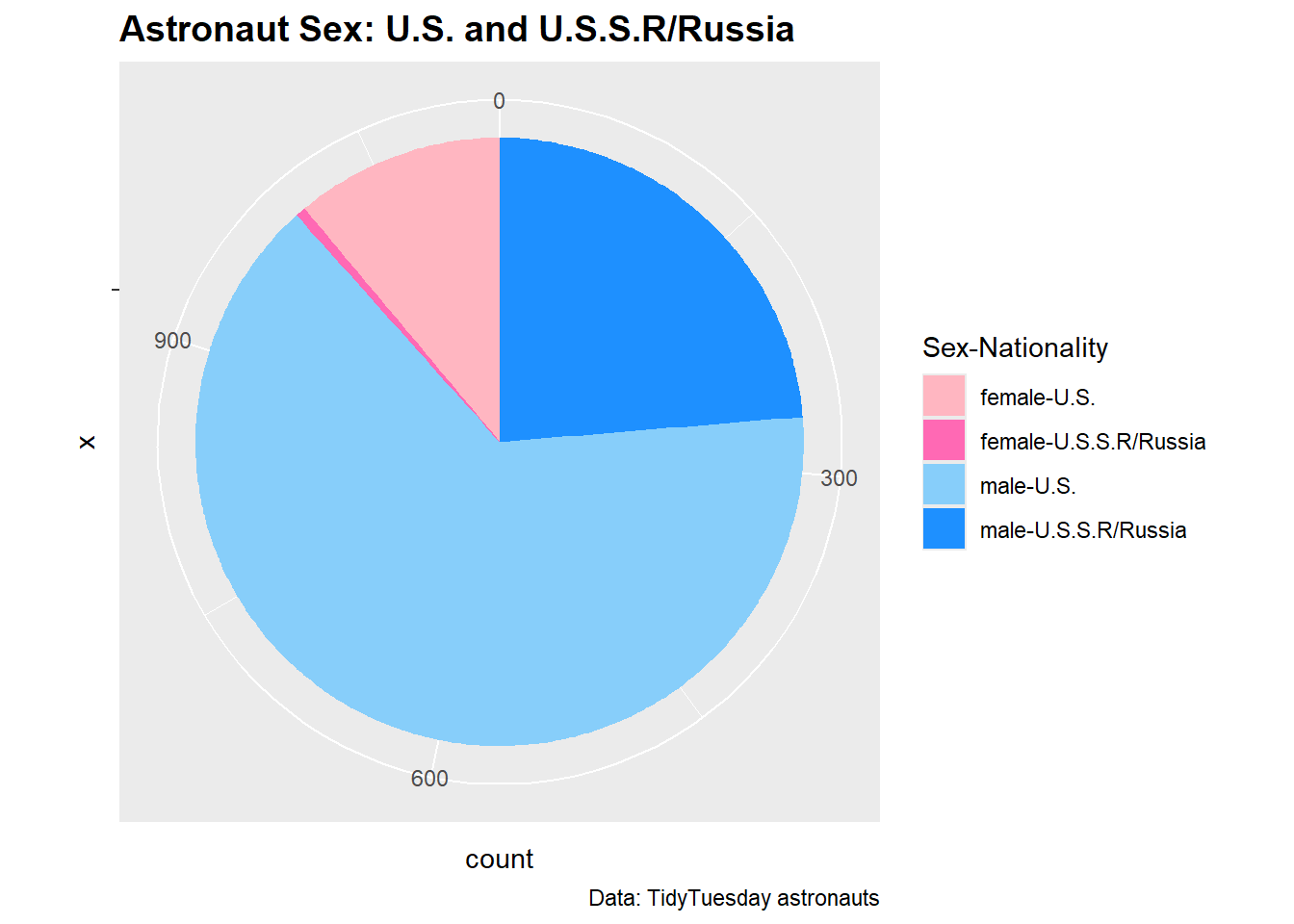
ggsave("gender_pie.pdf", gender_pie, width = 11, height = 8.5, units = "in")Ok, let’s look at distribution of astronauts by nationality through time with a waffle plot
nationality_waffle <- astronauts %>%
  filter(year_of_mission >= 2000) %>%
  count(year_of_mission,nationality) %>%
  ggplot(aes(fill=nationality,values=n)) +
  geom_waffle(color="white",size=.25,n_rows=3,flip=TRUE) +
  facet_wrap(~year_of_mission, nrow=2, strip.position="bottom") +
  scale_x_discrete() +
  scale_y_continuous() +
  coord_equal() +
  labs(title="International Composition of Astronauts",
       subtitle = "Since 2000") +
  theme_minimal() +
  theme(
    legend.position = "top",
  )
nationality_waffle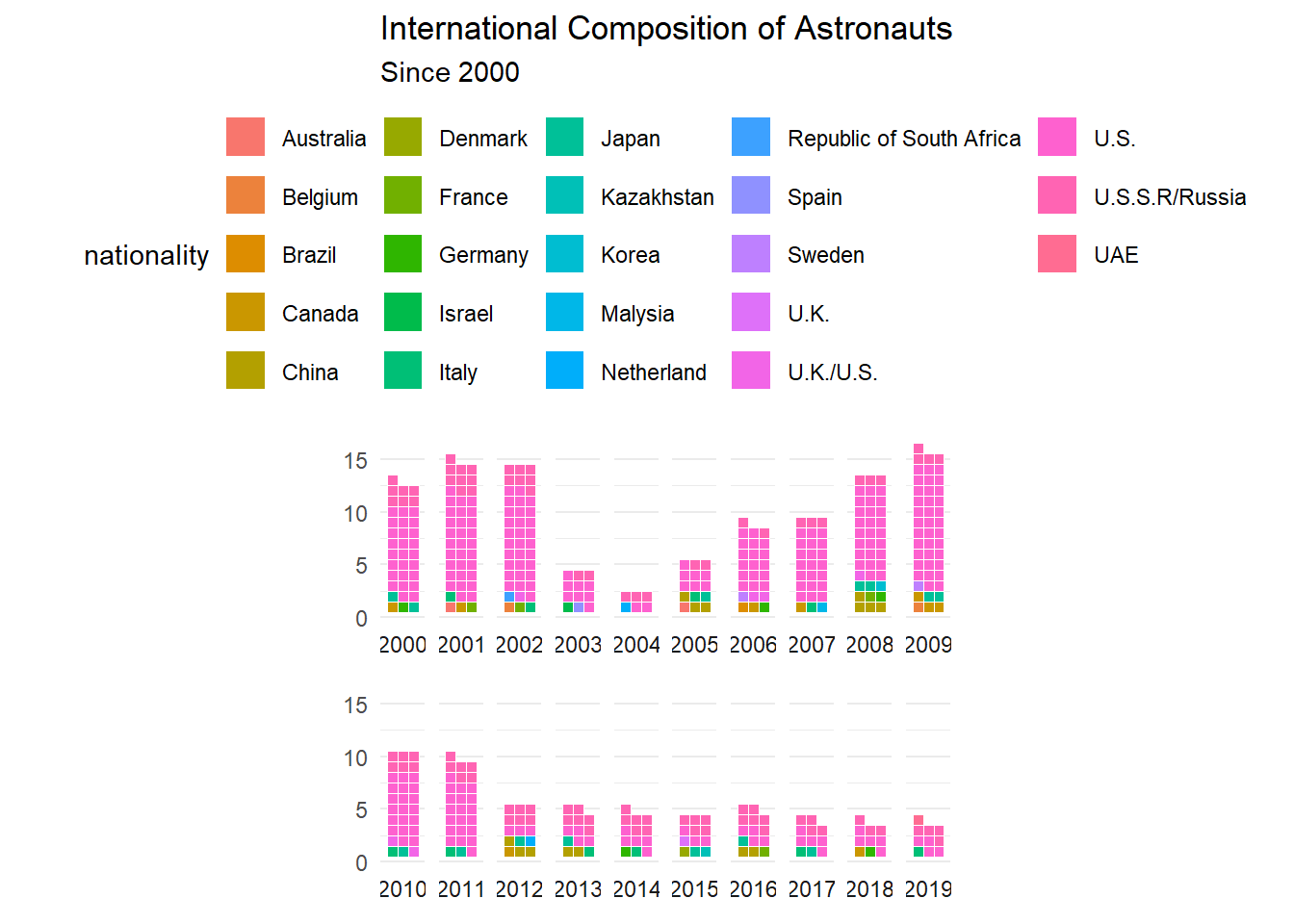
ggsave("nationality_waffle.pdf", nationality_waffle, width = 11, height = 8.5, units = "in")Lovely. now, let’s see how EV time varies based on occupation with a ridgeline plot
EVA_ridgeline <- astronauts %>%
  filter(eva_hrs_mission >= 1) %>%
  mutate(occupation = recode(occupation,
          "flight engineer" = "Flight engineer",
          "commander" = "Commander",
          "pilot" = "Pilot"
          )) %>%
  ggplot(aes(x=eva_hrs_mission,y=occupation,fill=occupation)) +
  geom_density_ridges(scale = 1,jittered_points = TRUE) +
  theme_ridges() +
  theme(legend.position = "none") +
  xlab("Hours Spent on EVA Mission") +
  ylab("") +
  labs(
    title = "Time Spent on Extra-Vehicular Assignments by Occupation",
    caption = "Data: TidyTuesday astronauts"
  )
EVA_ridgeline
## Picking joint bandwidth of 2.77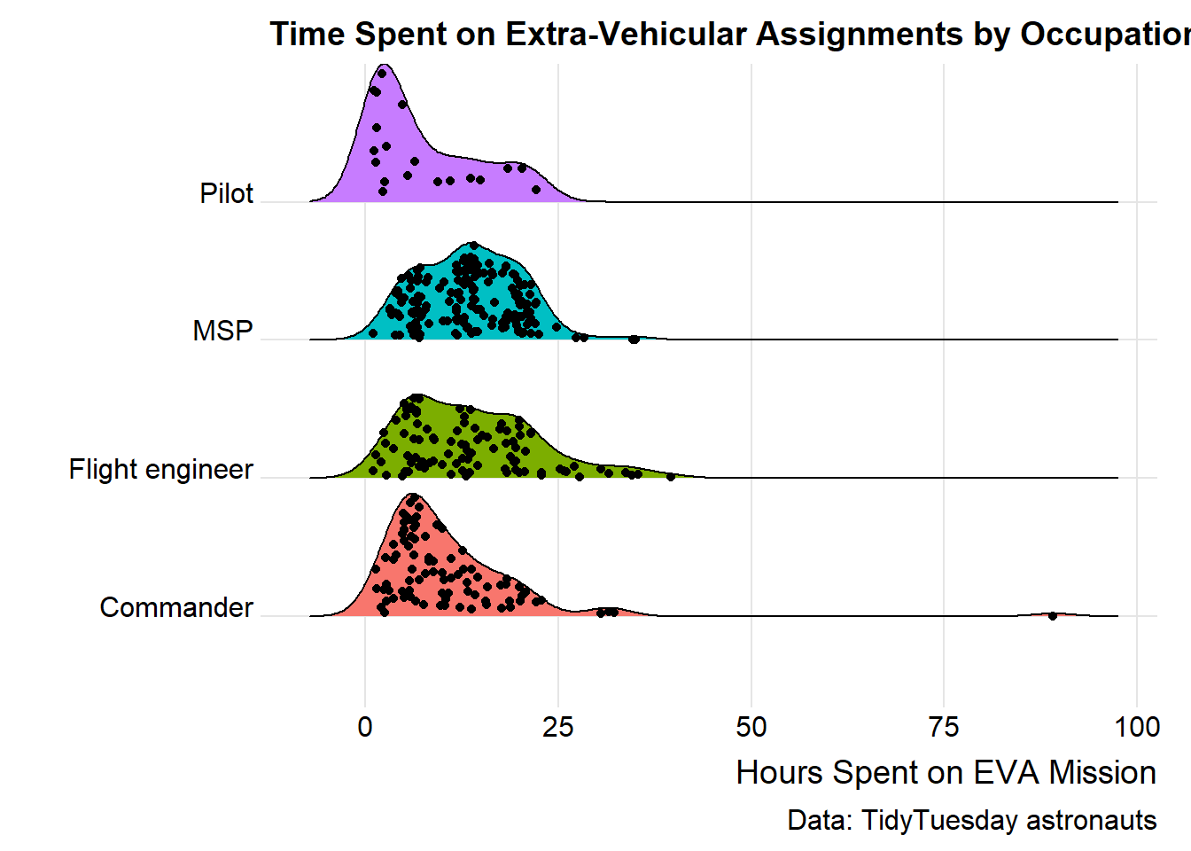
ggsave("EVA_ridgeline.pdf", EVA_ridgeline, width = 11, height = 8.5, units = "in")## Picking joint bandwidth of 2.77